INTERIOR BRANDING
Brightwok Kitchen
Sector
Hospitality
Location
Chicago
Brightwok Kitchen is a veggie focused, asian inspired restaurant with two locations in Chicago. Since 2015, they have been happily serving the Chicago community one "BWK Bowl" at a time. They believe in daily prep, which is why they marinate and grill their meets, make and mix their sauces, and chop their colorful vegetables bright and early everyday. They also celebrate each season with new and exciting menu additions based on available local produce and exciting flavors.
After researching our interior and branding work for Cemitas Puebla, owner, Jeremy Klaben approached estudiotres to help him design his vision for Brightwok's environmental experience.
"Our kitchen is a welcoming, happy & inspiring place where connections form and thrive."
Jeremy Klaben | Restaurateur
As Interior Branding Designers for Brightwok Kitchen, we have designed, built and installed several bespoke furniture and interior features for the front of the house.
Adams Street Feature Wall
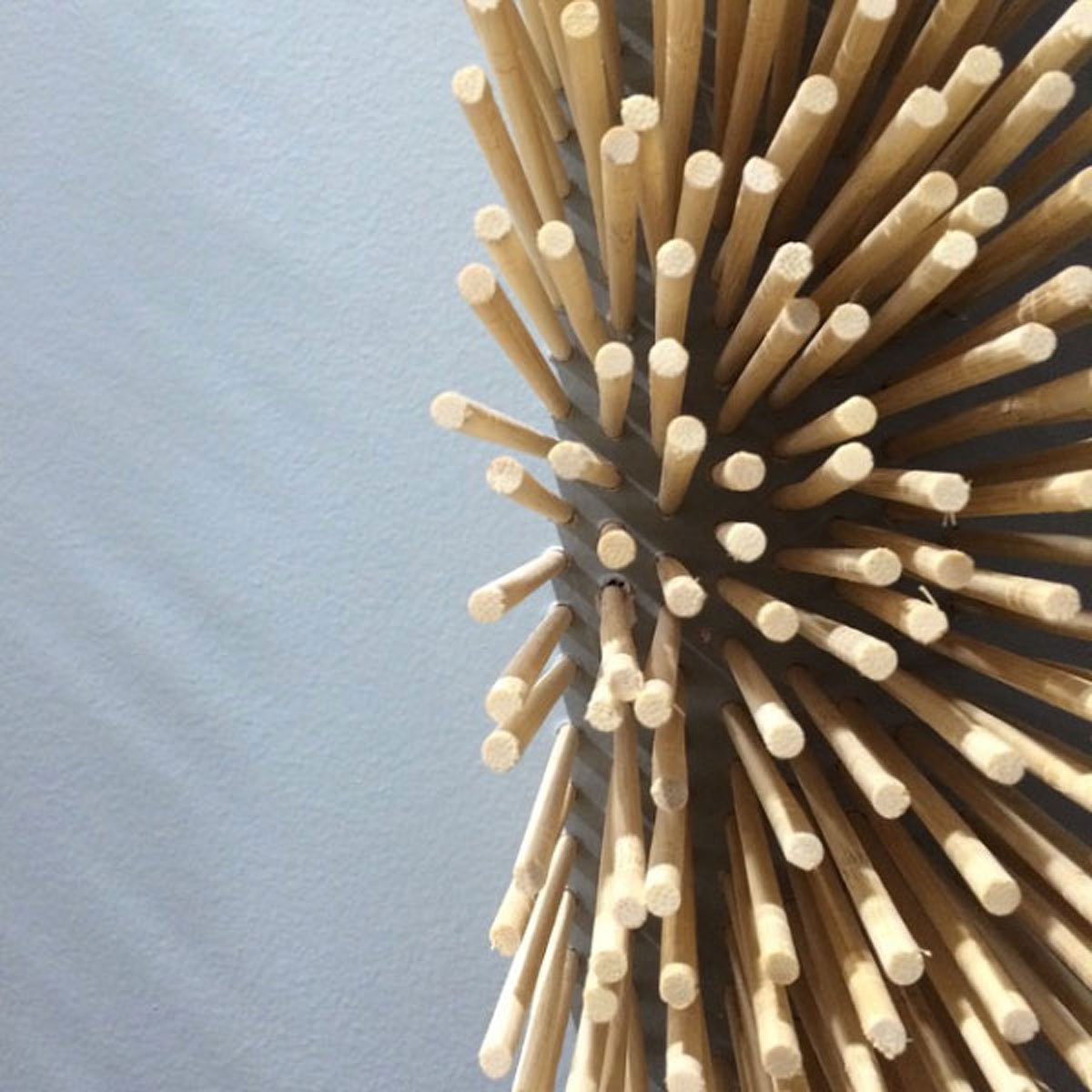
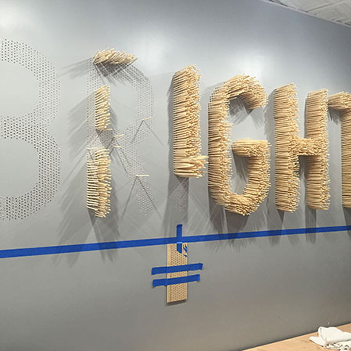
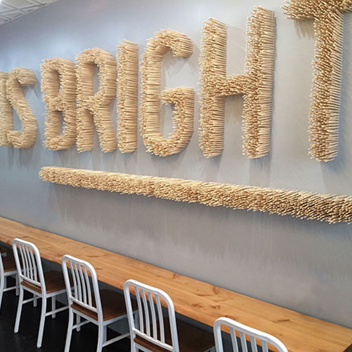
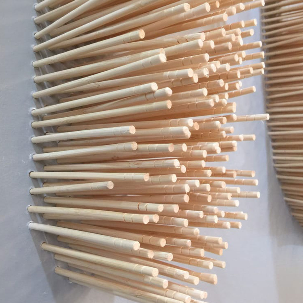
The Brightwok Feature Wall Installation for their first location was designed to draw people into the space. Over 20,000 chopsticks were painstakingly inserted into individual holes that were drilled out over three full days of labor. The goal was to take the viewer on a explorative discovery of... "oh, thats cool"... "wait, are those chopsticks?"... "that's incredible!"
Each 4 foot tall letter is made up of pine chopsticks place .25 inch apart in a stacking pattern. Each hole had to be individually drilled into the wall in order to make sure each chopstick protruded from the wall at 6 inches. The scale and detail of the installation gives the piece a must-see-to-believe gestalt.
State Street Feature Wall / Seating
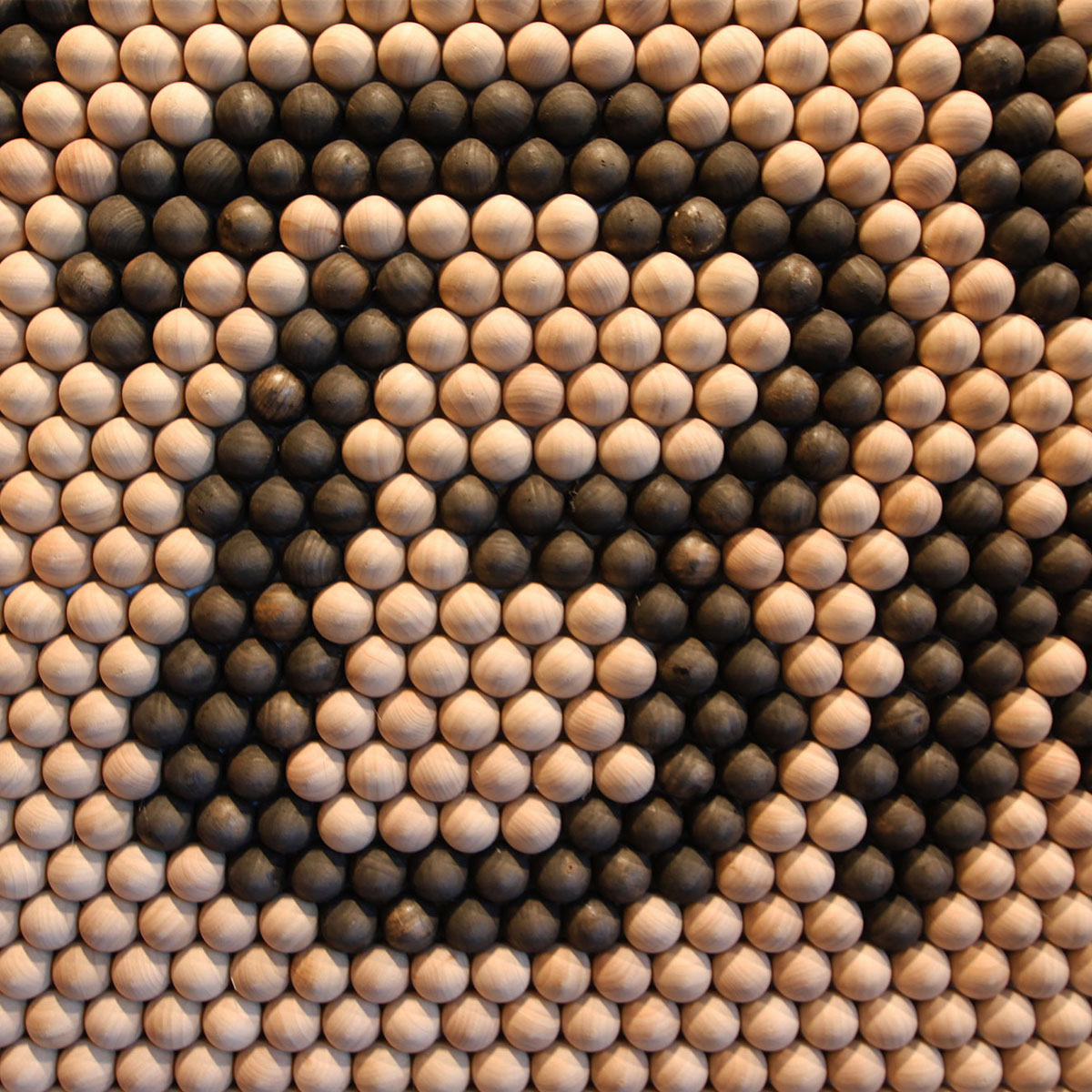
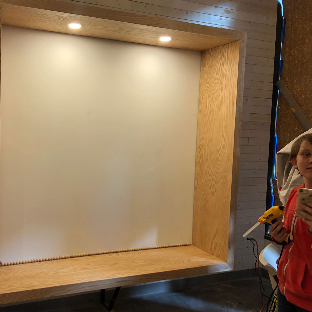
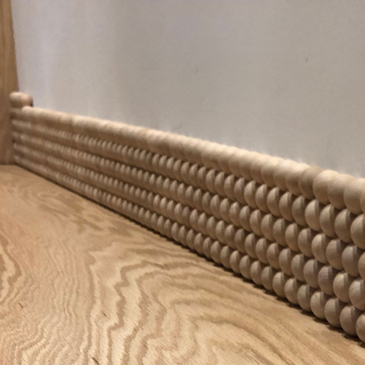
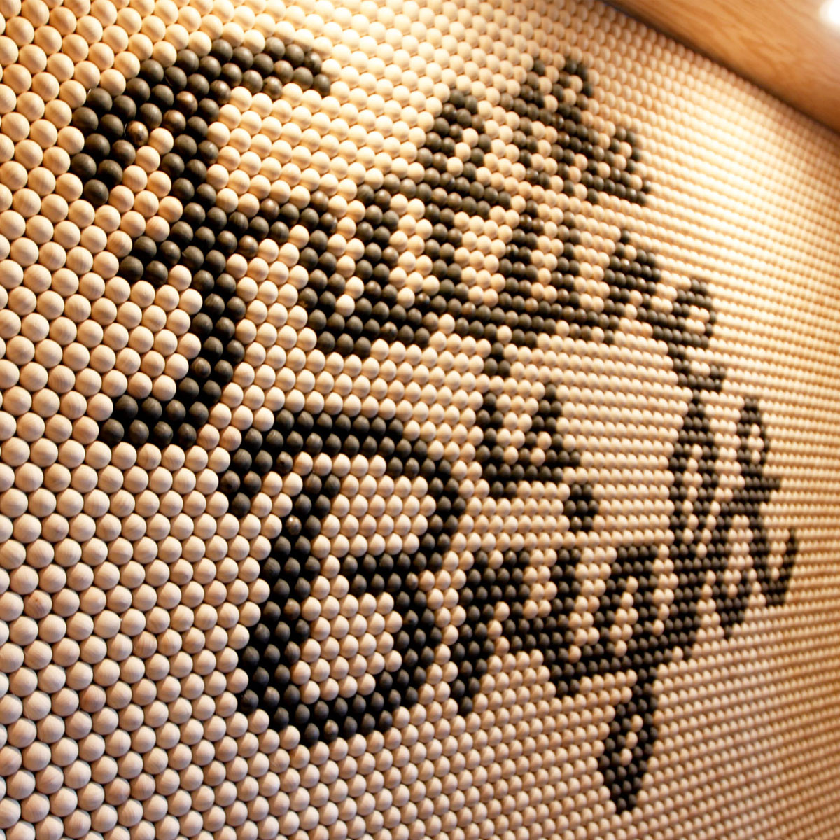
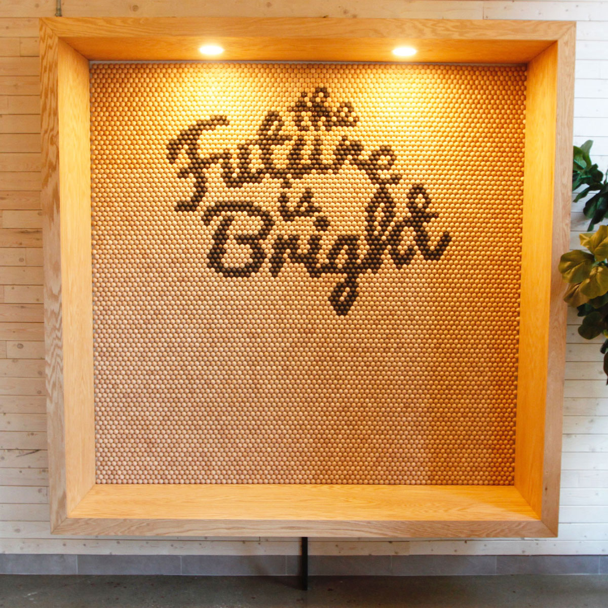
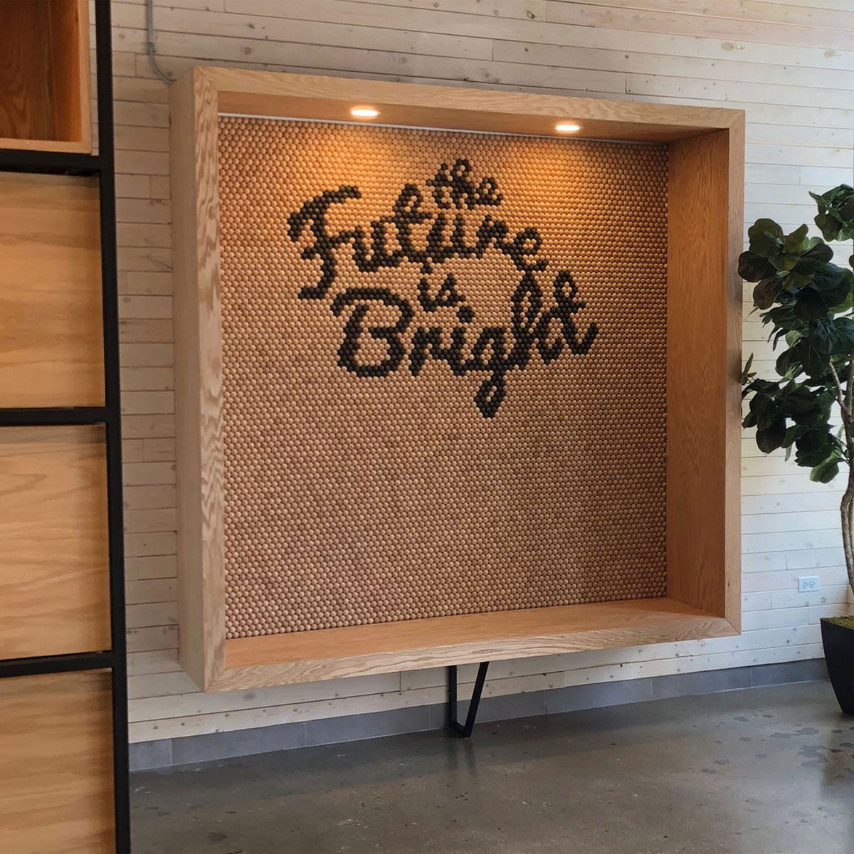
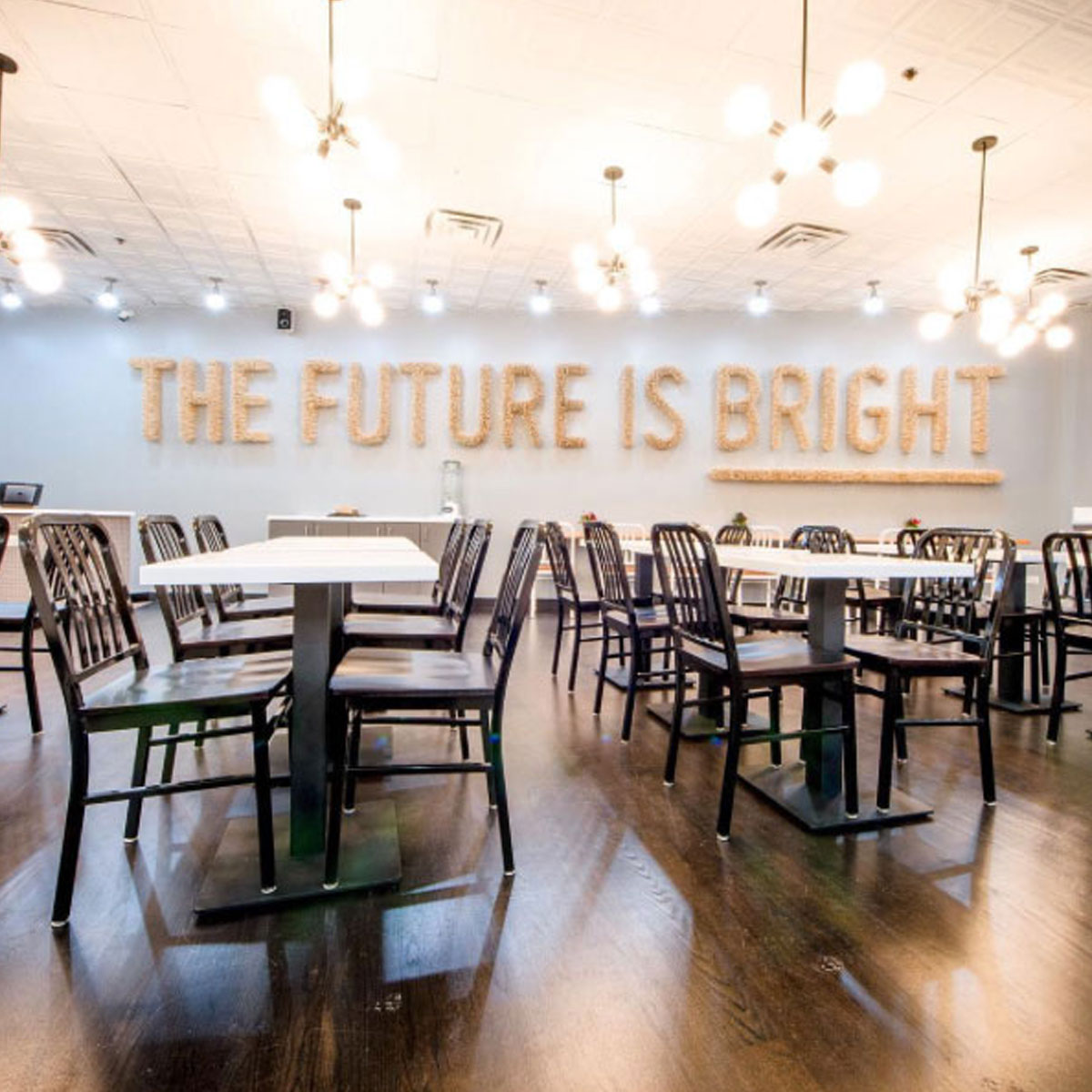
The Brightwok Feature Seating Installation was designed to be a focal point for the restaurant’s State Street Location. Made to allow the visitors to have their photo taken in front of the 7,155 one inch wooden balls laid out on the interior wall to read “The Future Is Bright”. Up close the messaging is abstract and difficult to read, but once seen through the camera lens the letters and words become clear.
